What is a brand style guide?
A brand style guide, more formally known as “brand guidelines” is a company-produced guide to how your brand elements should be used in any print or digital representation of your brand.
Your brand style guide represents your brand's colors, fonts, and overall style—but not how the market perceives you. A brand style guide includes the correct usage of the logo, colors, style of imagery, iconography, typography, copywriting voice and tone, and illustration guidelines. Some brand style guides include many details and even provide examples of correct versus incorrect usage of brand elements, while others are extremely brief.
What’s the point of a brand style guide?
The whole point of a brand style guide is to make it easier for your brand to be consistent and recognizable, regardless of whether the content creation occurs internally or externally. You can share your brand style guide with external partners, press, and agencies so they know how you want to be represented in the market. The best brand guidelines are short, to the point, and readily accessible via your press page on your company’s website so that changes can be made in real time.
What should you put into a brand style guide?
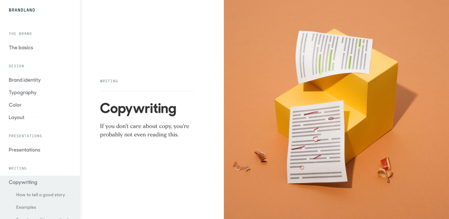
NASA’s brand guidelines from 1976 were an incredible 60 pages long! Today’s guidelines can’t be that long. Attention spans are short, and you need to get to the point quickly. Take the company Zendesk, for example. They include information like fonts, colors, layout, and even some tidbits on copywriting.

Source: Screenshot from https://brandland.zendesk.com/
One thing that NASA does well in their ‘76 brand style guide is include incorrect usage of the logo.

Source: Screenshot from NASA Graphics Standards Manual
Another great example of a brand style guide done right is that of the company X (formally known as Twitter.) Contrasted against NASA’s ‘76 brand style guide, it’s under two hundred words. The best brand guides are simple.

Source: Screenshot from https://about.twitter.com/en/who-we-are/brand-toolkit
What elements go into a brand style guide?
The main goal of a brand style guide is to be shared with others. Taking time to create one means ensuring your brand image stays consistent– even when handled by external parties.
A brand style guide should be a concise, easy-to-read digital document. It begins with the brand's mission statement and goes on to define the brand's look and feel as well as its tone of voice. A brand style guide usually includes the following:
- The tone of voice: How the brand uses language and emotion (including grammar, abbreviations, and acronyms)
- Typography: Font styles, sizes, and spacing
- Logos: Full resolution logos, secondary logos, and icons for download
- Color palette: Primary and secondary colors with HEX, RGB, CMYK, and Pantone codes
- Imagery: Photos, illustrations, and artwork
- Usage examples: Examples of acceptable and unacceptable uses
An example of a well-known brand that has an excellent brand style guide is the company Starbucks. They extend their brand style guide further than just core elements, including how seasonality affects the look and feel of their brand (see case studies.)

Source: Screenshot from https://creative.starbucks.com/case-studies/
If you're looking to develop a brand style guide to safeguard your brand identity and remain consistent when managed by external agencies, Bynder has the right tool for you.
Bynder's Brand Guidelines module offers dynamic, web-based guides that are easy to create, edit, and distribute to the right stakeholders. To find out more, book a demo with one of our experts.


