This question has come up for me as a content designer a few times recently. First, I got involved in an accessible fonts discussion on Twitter last year. Then, I was asked my opinion on readable fonts by a large charity. I shared the evidence that people who knew more than me had shared on Twitter. Lastly, I read The Non-Designer’s Design Book this January to learn more about graphic design, and the author, Robin Williams, had some insights on font choices.
Initially, my instinct was to stay away from this topic, as it’s hotly debated with no absolute consensus. However, in the spirit of helping us all aim for improvement, rather than perfection – especially as there may not be one perfect answer – I’ve gathered up a few observations about what makes the best font for reading.
Topline summary
What I learned can be summarised in these overall takeaways:
- User research and testing with a broad range of real users — in the context that they encounter your content — will help you find the best font for your purposes.
- Professional opinion varies, but some pointers around letter shape can guide you to make more accessible font choices.
- A sans serif font is not necessarily more readable than a serif font. In fact, some san serif fonts can be less readable than some serif fonts.
- Easy differentiation of letter shapes, and also between headings and body text, is essential.
- Font weight, as well as shape, needs to be considered for legibility.
- Exemplar, usability-tested accessible fonts are available.
Why is a clear font important?
Type font confuses people if it’s not well-defined. A study by Thomas Bohm of User Design, Illustration and Typesetting showed that the following letters and symbols were confusing for people aged 13 to 45, with no dyslexia or visual impairments. I’ve bolded the letters and characters that were confused.
clear / dear
turn / tum
CS5 / CSS
105 / IOS
5AM / SAM
Z2 / 22
LJ, LI, Ll / U
ce / oe
When you add a visual impairment or increase user age to over 45, the range of characters that may be confused increases:
i / j
B / 8
D / O, 0, o
0 / O o
k / R
a / o
F / f
r / v / Y
g / q
Similarly shaped letters and characters and short ascenders and descenders increase letter confusion and decrease legibility and readability for people with dyslexia.
In fact, GOV.UK avoids using certain characters in passcodes altogether because of these legibility issues.
Best fonts for reading
When looking for the best fonts for reading, you'll want to consider both legibility and availability. The ideal fonts are not just the easiest fonts to read on web pages but also the fonts available to most of the audience. In general, Microsoft fonts are a good choice and will be accessible to many people within your audience.
According to the Bureau of Internet Accessibility, the right fonts for website accessibility are:
Times New Roman
For many, Times New Roman has become the default font for print and web documents. This serif font has a relatively small x-height, but it is excellent regarding legibility.
Verdana
Verdana is another popular sans-serif font that's widely used because of its open counters and distinctive letter shapes. This font was created by Microsoft and reads well on both web pages and digital documents.
Arial
Arial is a popular sans-serif typeface with natural strokes and open counters that give it an organic look. While this was designed as a print font, its open design also looks great in web design.
Tahoma
Tahoma is another sans-serif typeface created for Microsoft. This font is similar to Verdana but with a narrower body, smaller counters, and tighter spacing between letters.
Helvetica
Helvetica is a traditional print font available on Mac, Unix, and newer versions of Windows. The tall x-height makes this font easier to read at a distance.
Calibri
Calibri is a font designed for Microsoft. While it does have an x-height that's not particularly large, it offers a good distinction between most characters, making it an excellent choice for those looking for an easy-to-read font.
These fonts are all simple, basic, and unadorned, adding no extra flourishes or decoration that may confuse readers on a computer screen. They are also popular font choices and therefore available on most computers, which means that they are accessible to a larger population than less popular fonts.
In addition, Penn State's Center for Accessibility and Usability recommends the following fonts based on their legibility and availability:
Verdana
Verdana is a sans-serif typeface that was designed for monitors by Microsoft. It's a popular font for accessibility because it has open counters and distinctive letterforms that help avoid confusion. Verdana reads well on both web pages and digital documents.
Lucida Sans (PC) or Lucida Grande (Mac)
Lucida Sans and Lucida Grande are sans-serif fonts that were designed to be legible when printed in a small size or displayed on a low-resolution display. This is an excellent choice for content displayed on mobile devices like smartphones or tablets.
Georgia
Georgia is a serif font that was designed for the Web, making it the ideal choice for online documents that may be considered difficult to read. Georgia remains legible even when reduced to a small size.
Pointers for a good, legible font
Steve O’Connor, Design Lead at Sigma, noted that there’s no single solution for all. For example, different fonts work for various people with dyslexia.
Gareth Ford Williams, Head of User Experience Design and Accessibility at BBC, wrote a detailed article on making good font choices, which WebAIM recommended I read: ‘What makes a typeface accessible and how to make informed decisions.
The following pointers gather together some of their recommendations.
Do have:
- Tall x-height: the height of the lower case letters like m, a, x, and r.
- The height difference between ascenders and capital letters, so that, for example, capital "i" and lower case "l" look different.
- Distinguishable characters, for example, L, l, and 1 should all look different from each other, as should o, e, c, a.
- Adequate letter spacing.
But avoid:
- Thin weights on smaller font sizes.
- Narrow-width fonts.
- Block capitals.
- Fonts, where the letters mirror each other, for example, d, b, p, and q, should have features that differentiate them from each other through more than just their ascender and descender position.
Heading font contrast is also important for readability
In her seminal book, the Non-Designer’s Design Book, Robin Williams stresses the importance of heading hierarchy and contrast. This means headings must be easy to perceive as different from body text and other heading ranks; for example, h2, h3, and h4 headings should be easy to tell apart from each other, as well as from body text.
To see this in action, here's a look at how GOV UK’s design system treats heading font sizes:
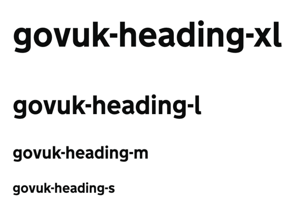

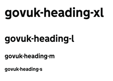 To explore font sizes, try using the following beneficial online tool: Typescale.com
Legible apostrophes and quotation marks
Another thing to check for is how defined the apostrophe and quote mark characters are. It is better to have curly or slanted marks than straight, vertical marks. If your default marks are straight, use the keystroke combination of option + Shift + { or }.
Exemplar fonts
While the GOV.UK font, GDS Transport, has been tested for usability, it’s not publicly available for use as it’s copyrighted, which is essential for it to remain associated with trustable public information.
Similarly, the BBC’s typeface family BBC Reith is copyright-protected. But it’s worth looking at because, as noted by Gareth Ford Williams, it was developed with a neuroscientist on the team. Their research user groups included people with moderate to severe vision impairment, dyslexia, and people who didn’t identify with any related conditions.
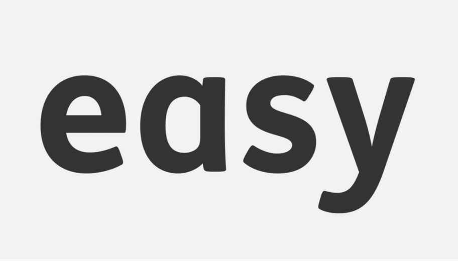
Mencap has made its accessible font, FS Me, available for public purchase and use. As they mention on the Fontsmith website, “every letter of FS Me was tested for its appeal and readability with a range of learning disability groups across the UK”. Here is a screenshot of one of the marketing images for their font:



Further reading and resources
- ‘What makes a typeface accessible and how to make informed decisions’ by Gareth Ford Williams
- ‘Can you tell your 1 from your l? Why letter legibility is key in type design’ by Sarah Dawood
- ‘Tips for creating good typography’ by Stephen McCarthy
- ‘The Non-Designer’s Design Book’ by Robin Williams
- Typescale.com
- FS Me font from Mencap
- D&AD on Universal Sans


