Getting your logo right is essential for telling your brand’s story, especially since consumers form an opinion of your brand in just 0.05 seconds. Color plays a crucial role in this— in fact, one study found that using a signature color can increase brand recognition by 80%.
With color being so important to branding, many logos are naturally designed with color psychology in mind, and therefore it’s likely that certain trends will emerge, particularly between similar brands.
But which colors are the most and least used in logos in 2024? And is it better to stand out or fit in within your sector?
What are the rarest shades used in logos?
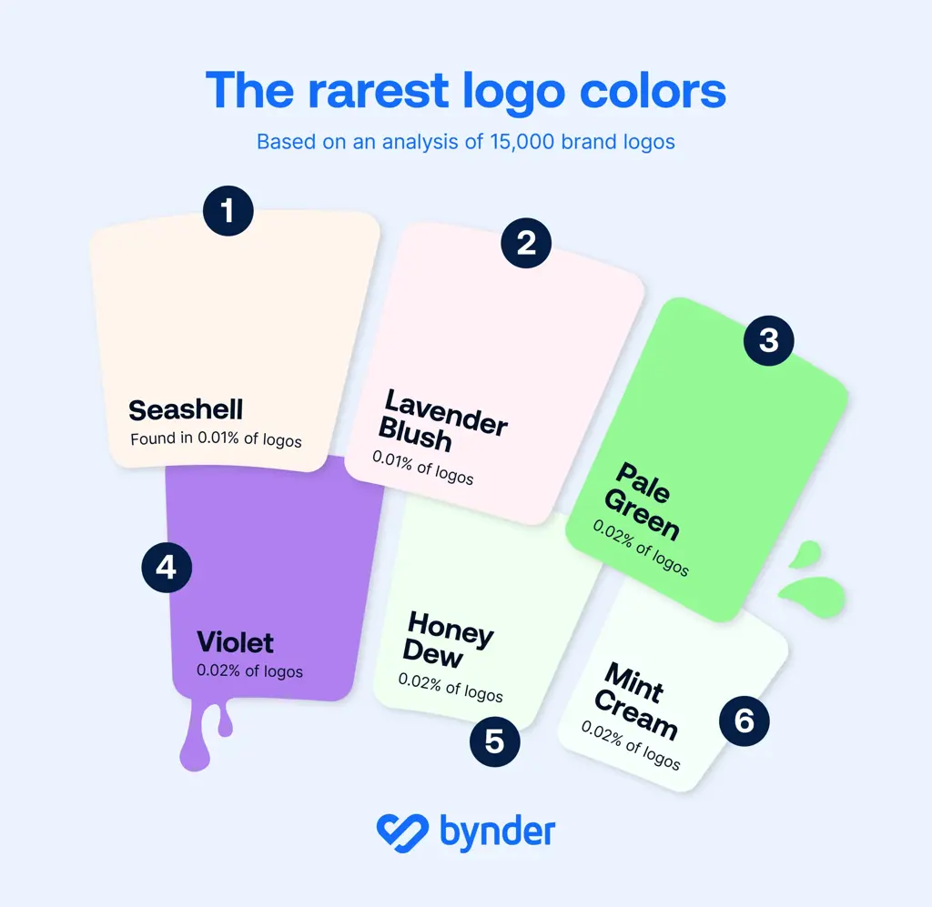
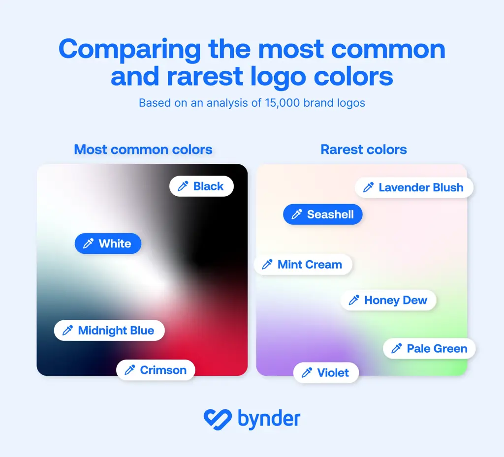
Pale pink tones, particularly "Seashell" and "Lavender Blush" are the rarest shades found in logos, representing just 0.01% of all designs. This means that these colors appear in only one out of every 10,000 logos.
This is according to our latest study, which involved analysing 15,388 logos, including versions for dark and light backgrounds.
Close behind are violet and pale green hues—including "Mint Cream", "Honeydew", and "Pale Green"—which make up 0.02% of logos. In other words, they appear in roughly 1 out of every 5,000 logos.


Commenting on the potential reasons for the rarity of these colors, Ljubica Jovanova, Senior Director of Content Marketing at Bynder, noted:
"Colors like mint green and pale pink are often associated with softness, calm, and subtlety, which may not align with the bold, attention-grabbing nature that many brands aim for in their logos.”
“Paler colors can sometimes pose legibility challenges, especially on digital platforms where contrast is key. As a result, brands might avoid these shades in favor of stronger, more visible colors to stand out in various environments."
Which colors are most common in logos in 2024?
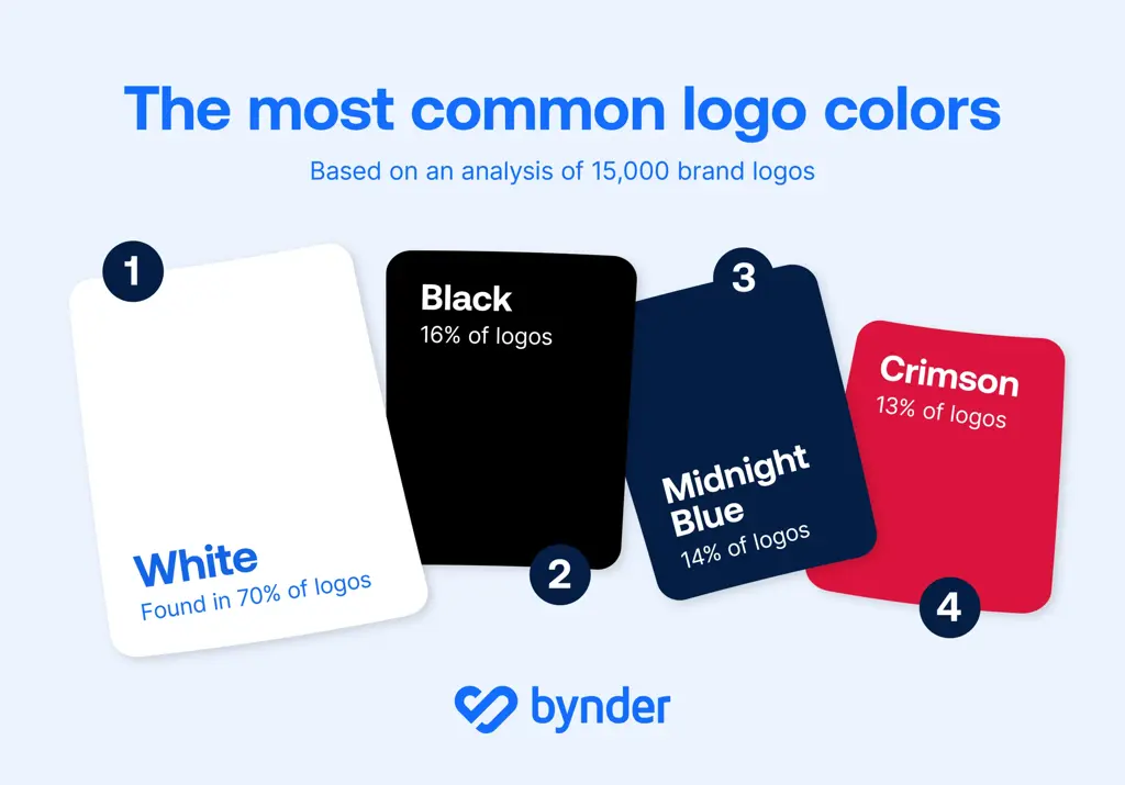
In 2024, white emerged as the most dominant color across logos, featured in an impressive 70% of designs across all sectors.
Black followed as the second most common color, used in 16% of all logos, while midnight blue claimed 14%, and crimson appeared in 13%.


Jovanova provides insights into the widespread use of white and black in logos:
"White and black are timeless, versatile colors that offer a high level of flexibility across different mediums.”
“White, in particular, is often associated with simplicity and clarity, which is why it remains a go-to choice for brands aiming for a clean, minimalist look. Black, on the other hand, conveys authority and sophistication, making it popular for brands that want to exude a sense of power or professionalism.”
“Both colors ultimately provide a neutral background that allows for other brand elements without any risks of clashing—such as typography and other primary colors—to stand out more prominently. Combining the two offers the ultimate contrast to make your logo bold and clear - take the infamous Apple logo, for example."
How do your logo colors compare in popularity within your sector?
Across all 12 sectors in which logo colors were analysed, white consistently emerged as the most frequently used color, further highlighting its universal appeal. Excluding white, the most commonly used colors across sectors reveal clear patterns.


- Midnight blue dominates in several sectors, including Basic Materials, Energy, Financial Services, Healthcare, and Utilities.
- Black is the most prevalent in sectors such as Communication Services, Consumer Cyclical, Industrials, Real Estate, and Technology.
- Interestingly, the Consumer Defensive sector stands out with crimson as the leading color, potentially reflecting energy or urgency within this industry.
Our analysis shows a strong preference for bold, classic and darker shades in branding.
How unique is your logo color?
We’ve created a tool to test out your own logo, to find out how rare its colors are.
Simply enter your logo’s color or the sector of your business to discover the popularity of your chosen shade across thousands of logos.
If you're launching a new business, rebranding your existing company and looking to change logo color, or just exploring market trends, our data can reveal how unique a brand’s logo colors are.
Expert weighs in on whether it’s better to stand out or fit in within your sector
We’ve seen clear logo color trends through our analysis, with certain sectors showing a preference for certain shades, such as Midnight Blue in Utilities and Black in technology.
But is it best to opt for a more rare shade and stand out, or follow suit with your branding within your sector? Jovanova advises:
"In today’s saturated digital marketplace, standing out is essential, and one of the most effective ways to do this is through the strategic use of color in a company’s logo.
Opting for rare or unexpected colors can provide brands with a distinct edge, instantly setting them apart from competitors who rely on more traditional shades. Uncommon colors not only create instant recognition but also evoke unique emotional responses, allowing brands to be seen as fresh, innovative, and different. By choosing colors that aren’t widely used in their industry, companies can disrupt consumer expectations, signaling creativity and a willingness to break away from the norm.
This approach can also appeal to niche audiences who are drawn to originality, helping brands foster deeper emotional connections and build a more memorable presence in the minds of consumers."
If you want to drive tangible business outcomes by leveraging strategic DAM and further strengthening customer loyalty through your brand identity, visit our Content Experiences (CX) for User Community page here.
Methodology
The study collected 9,547 company logos from companieslogo.com, with an additional 5,841 alternative logos for dark or light backgrounds, resulting in a dataset of 15,388 logos and compromising of 12 sectors.
All logos had transparent backgrounds for full image analysis. Color analysis was conducted to determine the proportion of each hexadecimal value used. Any color covering at least 5% of the logo was considered in the dataset. For logos with dark or light variants, identical sections were analyzed only once.
The identified colors were first collected by their hexadecimal values, then grouped into readable color names. The hexadecimal colors were translated into English by using the CSS2.1 (17 colors) and CSS3 (143 colors) lists, grouping colors by their closest match.
Company sector and country data were sourced from Yahoo Finance.


