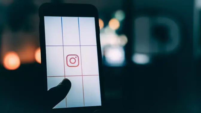
May 11th, 2016; Barack Obama was still president, Brexit hadn’t happened yet, and Instagram was about to unveil the most controversial tiny square of the year. Labeled a travesty; the biggest design fail of 2016, and even a f*@cking disaster by some, the reaction was immediate, critical, and polarizing.
Some loved it, but a lot hated it!
Delivered via an automatic software update, users (who missed the blog post) opened their smartphones to find a chalk outline of the once iconic leather-clad vintage camera laid dead on a swirl of sunset colors. The eruption of anger was instant.
So, why did the platform that brought us #hotdogsorlegs and made us feel #blessed at all the #dogsofinstagram feel the need to change things up? Ian Spalter, Instagram’s lead designer, wrote a Medium post addressing just that:
Brands, logos and products develop deep connections and associations with people, so you don’t just want to change them for the sake of novelty. But the Instagram icon and design was beginning to feel, well… not reflective of the community, and we thought we could make it better.
When Instagram was first launched, the app was all about adding a vintage feel to pics. Nostalgic filters reminiscent of the family photos that hung in your grandparents’ dining room were all the rage in 2010, and the techno-hipsters and early adopters loved it. Fast forward to 2016, and the community had changed.
Brands, visual artists, and the Kardashians are all over Instagram these days, but most importantly, so are the teens! The fresh-faced hashtag-savvy generation born after the year 2000 grew up with filters—so why would they care about giving their photos a vintage feel? And, why would a logo that showcased a camera wrapped in fake leather case matter to them either?
Simply put; it didn’t, but it mattered to many others. One of the (less emotional) criticisms made was that the new logo looked and felt like an altogether new brand, not an update or refresh. However, it was argued that while change may be scary, Instagram was long-overdue a makeover. It just so happens that by moving away from showcasing nostalgia for analog, Instagram was correctly in sync with the changing aesthetics of the web.
Our updated look reflects how vibrant and diverse your storytelling has become.
Today, the gradient, the flat design, and the neon shine of the new design sits perfectly in the internet of things. It also seemed Spalter and team were well prepared for the vitriol; himself making jokes that he was going to vacation in a bunker until the chaos had subsided. Now, two years on, the big question is; have we forgiven him for the redesign, and can we go back to mocking comic sans instead?


