From Full House to Sleater-Kinney, lots of trends from the 1990s are making a comeback. Fortunately, ’90s web design isn’t one of them.
In the ’90s, many brands treated web pages like a futuristic novelty. Lots of sites featured space themes and didn’t provide much useful information for customers.
Thanks to the Internet Archive’s Wayback Machine, we can see how brands’ websites have evolved over the last twenty years. Fortunately, today’s sites are ditching Times News Roman and using design to reflect brand identity. They’re also more functional, providing helpful information rather than simply serving as advertisements.
Check out how these five iconic brands’ websites have changed since the ’90s.
Nike
One of Nike’s early websites, archived in July 1998, showed an image of female athletes training and the caption “engineered for women athletes.” Links to various sports – including that other ‘90s trend, inline skating – ran along the left side and the bottom of the home page. Visitors followed the links to find training tips, stories, and gear.


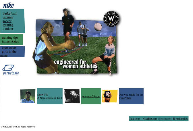


Nike’s current website still uses lots of images of female athletes on the homepage. Today, the site’s design is sleeker, featuring a large, rotating image and a simple header and footer menu. The site is much more explicitly retail-oriented, with “Shop the Collection” buttons featured prominently on homepage images.
McDonald’s
The fast food giant’s earliest archived website from November 1996 featured a bright red background and yellow Times New Roman font. The site also included an animation of a janitor cleaning the golden arches in McDonald’s logo.
Movement is still part of the brand’s site, although McDonald’s has upgraded to video on its homepage and footer images that fall away when clicked. Also, today’s site is easier to navigate. In 1996, visitors had to click through a page of terms and conditions before they reached menus, nutrition, or other information.
Coca-Cola
Coca-Cola’s first website, launched in April 1995, actually predates the Wayback Machine’s archive, according to Coca-Cola’s archivist. However, the company saved a screen grab of its black-and-white homepage, which featured a Coke bottle blasting into space under the words “The Galaxy of Coca-Cola.” The site also feature link to click on the company’s shareholders’ report.
Today, their website is more closely aligned with the brand’s focus on happiness, using the brand’s signature red in its menu bar and the tagline “Open Happiness.”
The brand also has a “Share a Coke” website, where you can customize your own Coke bottle. In a modern world, where 74% of online consumers expect personalized branding based on their interests, Coke is leading the trend there. The brand also has a separate consumer site from its corporate site, featuring articles and information for investors.
Mars
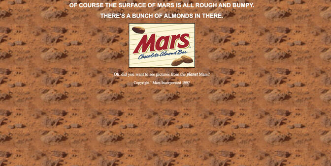
With a brand named Mars, it’s hard to resist space jokes. The brand’s earliest website, archived in December 1997, was a combination of space humor and advertisement. The homepage depicted the surface of the planet Mars and the brand’s logo, with the tagline “Of course the surface of Mars is all rough and bumpy. There’s a bunch of almonds in there.” The site didn’t include any information about the candy bar, but featured a link to a NASA website about the Mars Pathfinder project.

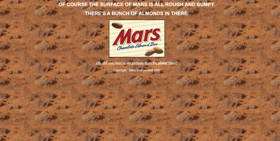
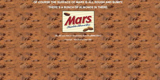
Today, mars.com doesn’t use the same sense of humor, but provides lots of news and information about the company and its candy brands.
Apple
Early Apple websites, first archived in October 1996, featured a lot of text on the homepage, announcing everything from the new PowerBook family of computers to “chats” with Apple Fellow and legendary “hardware and software evangelist” Guy Kawasaki.
Today, Apple’s homepage still focuses on new products and technological innovation, but the site’s design features less text and more images, reflecting the sleek, modern ethos of the brand.


