Inevitably, when you don’t get the full context to a feature, product, or any subject for that matter—we may as well be speaking to a brick wall! So, much like our previous posts, we’re going to shine a spotlight on our features and functionality, and explain use cases with real-life context for better understanding.
After we’ve looked into rebranding, digital transformation, new market expansion, and product launches in the last four installments, we're introducing two new stories as part of the Context is queen encore. Our first story will be one of mergers and acquisitions, outlining how Bynder’s Studio module makes those initiatives—at least when it comes to branding—a whole lot easier.
We’re merging! The change to all branded collateral begins!
Wait. What? Consider this: an American retail company “Seeing Double” is merging with its largest competitor in Europe. Exciting, right? They’re joining forces! And while the majority of employees are sipping champagne and buddying up with their new colleagues, the management team is bracing themselves.
They know that there’s a lot of work to do following the announcement. There are many moving parts to bring together into one cohesive whole during the merger and acquisition process; in our story, we will focus on the branding side of things.
When looking at branding, shiny new colors and logos aside, a merger means redesigning, restructuring, centralizing and giving access to the right people for the right files, and in a way that is smooth, efficient and with minimal disruption to the day-to-day activities of employees. The fact is that M&As can be a messy process, and it’s all too easy to slip into content chaos where no one knows where content is, who it belongs to, and how it should be used.

Our hypothetical retail company, Seeing Double, got Bynder onboard to help them streamline communication across organizations, give the right stakeholders access to the right materials, and centralize assets, ready to be rebranded. What better time for a much-needed refresh of their copy and design, along with a scalable, easy-to-use templating solution for a helping hand?
Ultimately, processes need to be merged and branding content needs to be updated across internal and external channels.
So how can Bynder help with this? Enter Studio!
By providing reusable templates that allow everyone—not just the designers—to create on-brand content in minutes instead of hours, Studio provides peace of mind that design principles are adhered to, ensuring consistency and enabling faster time to market.
Due to the tight schedule of our rebranding, it was key that the Bynder system was ready for productive use within a very short time. This enabled us to distribute all the new assets in a fast and uncomplicated way to all our marketeers in the DPDgroup country organizations.Torsten Daeges
Marketing Coordinator at DPDgroup
We started looking into American retail company Seeing Double’s M&A story. And as it's often the case with the M&A process, it sounded pretty challenging! Today, let’s have a look over the shoulder of the design team at Seeing Double.
They’ve been busy coming up with a fresh new look that combines design elements of both brands into one. After they’ve agreed on the new branding, presented it to the right stakeholders, and eventually got everyone’s buy-in, they are ready to face the next challenge: scaling content creation!
With that in mind, they’re already sweating at the thought of their marketing colleagues demanding content thick and fast:
We need new Google ads, more Instagram, Facebook, Twitter and Linkedin banners! By yesterday! Localized in French, German and Spanish por favor!
While this may be a common nightmare among creatives undergoing the M&A process, the Seeing Double design team have their secret weapon to scaling content with speed and style: Bynder’s Studio of course!

Jonas, senior designer at Seeing Double, created Sketch files with his team for all the various formats and channels that the company uses for marketing.The other design team in the merging company is used to working with Photoshop, and they’ve decided that—for the first round of content creation—everyone will continue to work with the design tools and programs they’re used to...
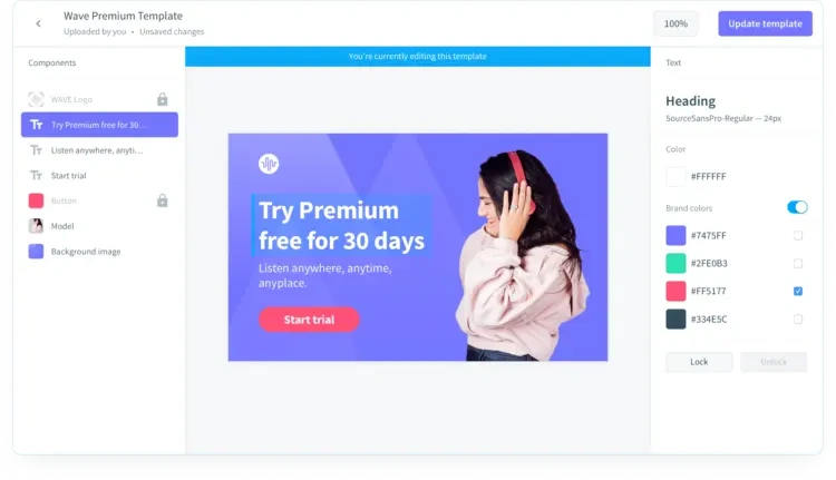
Typically this could cause headaches and bottlenecks, but this is no obstacle when working with Bynder’s Studio. For instance, Jonas can simply drop the Sketch and Photoshop files and upload them into the relevant campaigns. He uploads fonts and colors that have been carefully designed and chosen beforehand.
All placeholder texts and images have been predefined in the original Sketch and Photoshop files. It’s the first time that the brand new designs are uploaded into a tool. And Seeing Double, we feel honored you’re using Bynder for this exciting debut as one company!
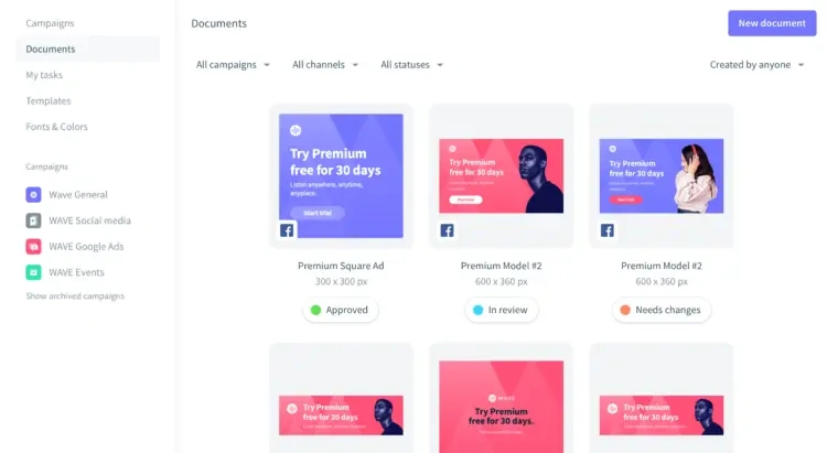
Jonas sets approvers and enables the new assets either for download only, or also to be saved for storage in the asset bank—depending on whether they’ll be used internally or externally.
He created collections (groups of files for simple sharing) beforehand with all those slick new background images which the creative teams have worked so hard to put together. Now, easy as 1,2,3, Jonas defines those collections as sources of possible background images. He locks the editing rights on logos because, god forbid, let’s not have anyone accidentally applying the old company logo to the new collateral. After all, a strong first impression can go a long way with branding! He clicks ‘Update Template’ and it’s done.
Templates are such an easy way for our users to get done what they need to get done. If they need a web banner or an image for social that already has our logo on it, they just want to go in, get the template, change the picture or text and are done. That’s great!Sarah Roozendaal
Brand Manager at AkzoNobel
We explored how Seeing Double’s design team tackled the tricky process of rebranding and reworking content fit for their new unified company with Bynder’s Studio.
Teams across the board have been busy integrating different elements of the business, and there’s still a lot more work to be done. In the previous post, we covered how the creative teams produced Sketch and Photoshop files which were then uploaded into Bynder. So what now?
Head of Marketing Marina is ready to get her team creating new Google ads and Facebook banners. After all, they’re excited to bring their fresh new brand identity to the masses! The merger announcement has brought them a lot of exposure, and they want to keep the momentum going.
Seeing Double has been working with Bynder’s DAM for months, and they know their way around by now.
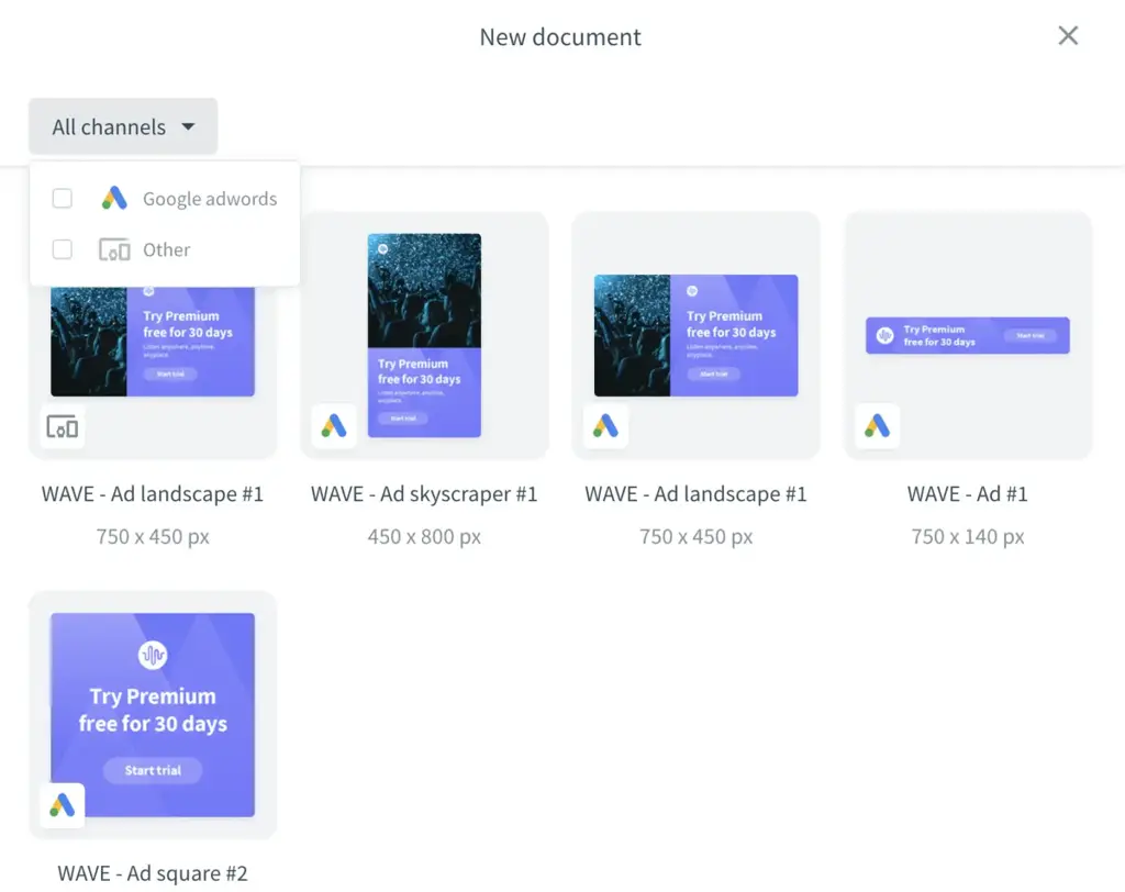
But what’s that in the top menu bar: Studio? Click. Templates. Click. Google Adwords. Click. Create New Document. So simple and so quick, a monkey could do it.


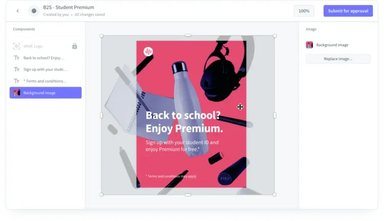
Marina is looking at a Google ads template that has the new logo and fonts incorporated. She’s editing the text and then clicks on the background image. She gets to choose from a fixed set of images and moves it around until it shows the exact right crop. Download. Click.

Before she knows it, her team is creating banners for all relevant channels in all the relevant languages—without needing to reinvent the wheel, saving so much time and resources. The fact that all branding elements, placements, and images are predefined turns this job into probably one of the easiest throughout the entire merger.
With Bynder Studio, Seeing Double was able to create hundreds of banners, fully self-serviceable and in no time at all! It helped their marketers create more content quickly while sticking to design principles, ensuring consistency and enabling faster time to market.
At the same time, creatives had more time to tackle their hefty to-do lists and really focus on the beauty of creation instead of tackling repetitive and tedious tasks like changing words or localizing content.
What a success story, right? Well, there’s one more story to come, and that’ll be all about getting instantly published on-brand, or in short - IPO.


